PURE Skincare participated at INFARMA Barcelona 2025, presenting an immersive brand stand that unified four distributed skincare brands under one identity; PURE SKINCARE.
As Head Designer, I led the creative concept and visual direction, from the initial idea and storytelling to the final stand and immersive video experience.
How to represent PURE’s essence
HARMONIZE OUR DISTINCT BRANDS UNDER ONE VISUAL STORY
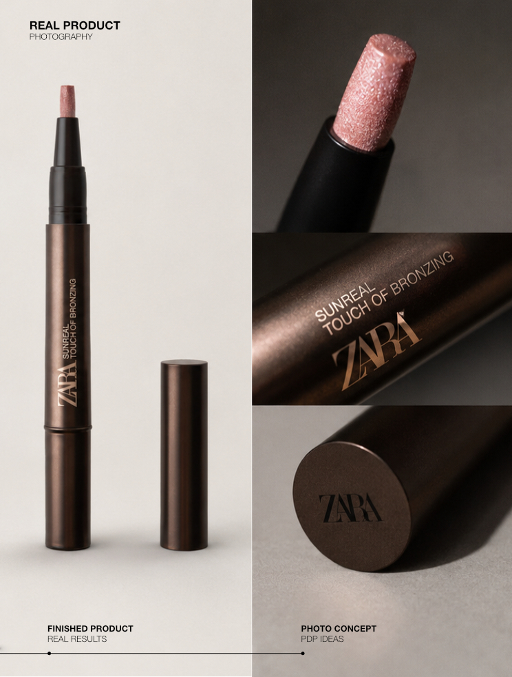
Each of the four brands had unique visual languages, color palettes, and packaging.
The challenge was to create a unified visual identity that could express PURE’s essence, the intersection between science and purity, while maintaining the individuality of each brand.
Where advanced science meets purity
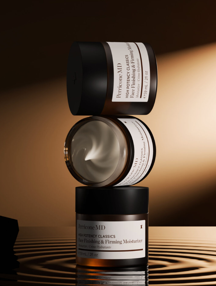
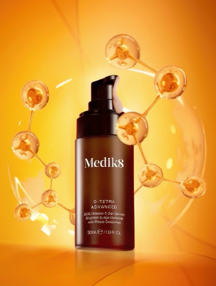
PURE Skincare represents the fusion of scientific innovation and natural balance. We translated this into two core elements: Water: symbolizing purity, precision, and clarity (Perricone MD & Medik8) Earth: representing nutrition, nature, and origin (Byoode & Advanced Nutrition Programme)
This conceptual duality guided the art direction, color palette, and spatial design for the stand and the immersive video.
Designing an Immersive Brand Experience
In a highly competitive environment like INFARMA, surrounded by major pharmaceutical and cosmetic players, our goal was clear: to create a visually striking stand that would elevate PURE to the level of leading international brands and attract the attention of professionals and visitors. The creative strategy centered on translating the concept of “science and purity” into a tangible, multi-brand experience.
We needed to represent PURE as the umbrella identity while showcasing four distinct brands, each with its own visual universe in a unified, elegant composition.
The stand featured six printed panels and two large LED screens. The central wall represented PURE’s identity through a single image divided into four sections, one for each brand, merging them under PURE’s aesthetic.
Each section included illuminated glass shelves showcasing hero products, blending graphic and spatial design to create depth and visibility.
Two additional panels highlighted PURE’s core elements: Water (Perricone MD, Medik8) symbolizing purity and innovation. Earth (Byoode, Advanced Nutrition Programme) representing natural origin and nourishment.
Beyond the central wall, we created two additional panels representing the PURE elements:
Water, featuring Perricone MD and Medik8, symbolizing purity and innovation.
Earth, featuring Byoode and Advanced Nutrition Programme, reflecting natural origin and nourishment.
This dual representation visually reinforced PURE’s narrative: the meeting point between nature and science.
Two large LED screens were positioned on the front-facing columns, the most visible points of the stand.
These were designed to act as attractors, catching attention from the main corridors of the fair. The immersive video, an extension of the visual concept showed PURE as a living ecosystem: the logo emerging from water, guiding viewers through a cinematic journey where each brand appeared in its natural environment.
This approach not only created a sensory experience but also positioned PURE as the narrator and connector of all its distributed brands.
A cohesive and striking stand
Brands unified
4
Storytelling panels
8
Exhibitors
200+
Visitors at Infarma
0k
The result was a stand that combined creativity, strategy, and emotion. An environment that communicated the unity of the PURE portfolio, while visually competing at the level of leading skincare brands at INFARMA.
Pure SkincareINFARMA 2025
Role: Head Designer / Creative Direction & Concept Development
This achievement was possible thanks to a collaborative effort between the Design, Marketing, and Brand Managers teams, who worked together to bring this vision to life transforming an idea into a cohesive and immersive brand experience.
Special gratitude to our brilliant Design Team! a group of creative minds whose talent, imagination, and dedication made this project possible. Grateful to be part of this amazing team: Dani, Laia & Manu.